
Illustrator Sam Kalda: Interview
- 29th August 2018
- Category : Blog,Interviews & Blogs
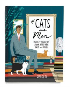
Based in the States, Sam Kalda is the illustrator for the Fairlight Moderns series. In 2017, Sam published his first book, Of Cats and Men: History’s Great Cat-loving Artists, Writers, Thinkers and Statesmen, and received a gold medal in book illustration from the Society of Illustrators in New York. Throughout the years he has collaborated with such famous names as The New York Times, Vogue.com, The Guardian, Penguin and ASOS. We have chatted to Sam about his art, creativity, and what it is like to be an illustrator.

How did you get into the arts and what led you to illustrating?
I’ve been drawing since early childhood. I kept at it and ended up majoring in painting in college. After graduating, I had an idea for a picture book and began drawing it. In the process, I became interested in pursuing illustration as a career, and enrolled in an MFA program in illustration at Fashion Institute of Technology in New York.
How book-illustrating is different from your other work, and what do you enjoy the most about it?
Working on books is my favourite aspect of being a freelance illustrator. I’m a reader and come from a family of readers, so I have a lot of respect for the importance of a good cover and interior illustrations. I like working on book projects because they often have slightly longer deadlines, which allows for more in-depth development.
What is your process in producing a book cover?
I work on sketch tiny thumbnails based on the abstracts/selections from the novel. While reading, I’ll underline core ideas, or interesting visual language. From there, I’ll jot down some word associations. After I have some workable thumbnails, I’ll develop those into cleaner sketches. I sketch in pencil, but the final images I often paint in Photoshop, adding in handmade textures of ink and charcoal.
How much of the book do you need to read before creating a cover for it?
It depends on the book. For some books, the visual direction is quite clear from the beginning – especially those focused on a particular place. In the case of more subtle stories, ideally, I’d like to read several chapters to mine some ideas.
For someone who has experience in working for clients as well as creating your own projects, do you prefer to be given artistic space to ‘do your thing’ or to be supervised?
It all depends on the relationship with the designer/art director. There are times when I’m very appreciative of some guidance. Having total control is great, but having another eye on a project is key. Sometimes you’re asked to ‘do your own thing,’ and then asked afterwards why you did it that way. Mostly, I just want to be trusted by the art director. There will be tweaks here and there, that’s inevitable…
How many revisions does it usually take you to finalise cover illustrations?
Ideally, none! It all depends. Usually, the revisions happen in the sketch stage and the kinks are worked out before going to final art.
What makes a great book cover for you?
I think it needs to capture the mood of the book. Other than that, I’m not too prescriptive. Nice printing and paper quality is a selling point for me.
What has been your favourite cover to make?
I think my favourite would be the cover for my own book, Of Cats and Men: History’s Great Cat-loving Artists, Writers, Thinkers and Statesmen. I was able to design a wraparound cover that incorporated the back matter into bookshelves. It’s that ‘total control’ feeling I mentioned before.
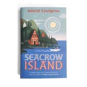
After receiving a brief for a book illustration, do you tend to research books in the same genre to get inspiration or do you try and stay away from them? What about if the books have been published before (like Astrid Lindgren’s Seacrow Island)?
I try to stay away from books in the same genre, especially contemporary books. I have many books on vintage book cover design, and I will peruse those. Lately, I’ve been looking at Edward Bawden’s book covers for inspiration.
In the case of Seacrow Island, I did look to see what was out there. I wanted to make sure my sketches offered something different. I think if it’s a well-known title, it helps to see what has been done in the past.
Your illustrations seem effortless. What or who, you find, inspire them?
I collect art and design books, as well as interesting vintage books/ephemera. I love the work of Nigel Peake, Maira Kalman, Ludwig Bemelmans, Edward Bawden, to name a few.
Do you have a favourite book genre to illustrate for?
No genre in particular. I like stories that allow for some quirky yet understated imagery.
Can you see any book-cover trends around the world at the moment that you especially enjoy or dislike?
I’m seeing so much illustration on book covers these days, which is exciting. Things I dislike? Movie tie-in book covers. Not a trend per se, but a bad habit, to be sure.
Do you have a dream book you’d love to illustrate one day?
I’d love to illustrate a book of mythology. If I had to pick one, maybe the classic: Mythology by Edith Hamilton.
To find out more about Sam, visit his website or Folio Art.

