
Designer Nathan Burton: Interview
- 9th February 2021
- Category : Blog,Interviews & Blogs
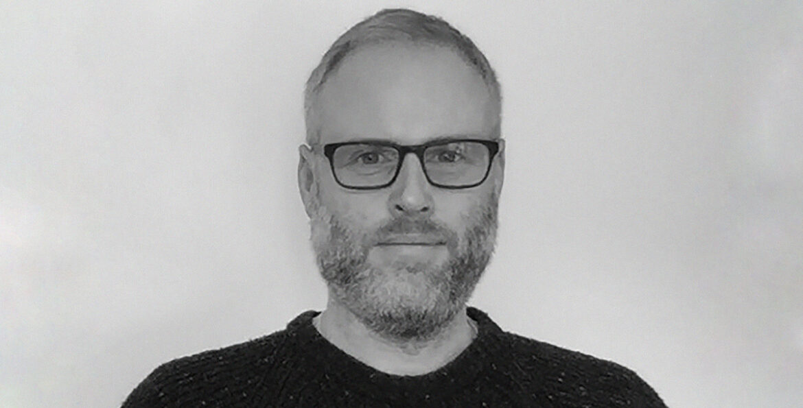
Nathan Burton is the designer behind the cover of David and Ameena. We’ve talked to him about his path into graphic designing and his creative process.
How did you get into the arts and what led you to book design?
I did a degree course in graphic design at the University of Northumbria in Newcastle which had a very strong illustration element to it. I took my portfolio to various design firms and publishers and it happened that there was an opening at Bloomsbury Publishing for a junior. The art director at the time, Will Webb, had gone to the same university and I think he saw similarities in my work to his when he’d graduated. It was very much a second education working for him.
You mention on your website that you mostly work on book covers. Have you worked on or would you like to work on designing anything else?
It’s pretty much all book covers but very occasionally I get a job outside publishing which makes a nice change.
What is your process in producing a book cover?
I always start by reading the manuscript (or synopsis if there is no manuscript). I make thumbnail sketches as I go along and then work up the most promising of those.
Are you a reader yourself? How much (if any) of the book do you need to read before designing a cover for it?
I love reading and I usually have a book on the go that’s not work related. When I’m designing a cover I read as much of the book as possible as it’s good to get a feel for a book beyond the brief.
How hard is it to follow someone else’s guidelines to create the designs? Is there anything clients could do/stop doing to make your work easier?
It really depends on the guidelines. I’ve had quite a few jobs which have been improved by an art directors input. Sometimes it’s difficult to figure out why something isn’t working so it helps to have a creative set of eyes take a fresh look and help steer an idea.
When working, do you prefer to be given artistic space to ‘do your thing’ (and if yes, do you feel like you are given enough space) or do you like to be supervised?
It’s nice to get a bit of artistic space and many of the briefs I work on are fairly open but I don’t mind a bit of direction. I think it’s a happy balance between the two.
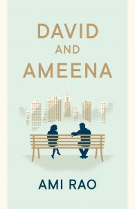
Could you walk us through your working process for creating a jacket for David and Ameena?
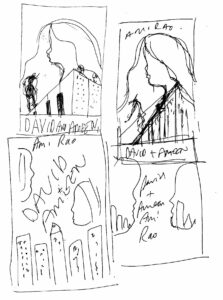
This is the story of David, an aspiring jazz pianist and Ameena, a British-Pakistani girl who fall in love in modern day New York. The publisher wanted a simple design that included the two characters (making it obvious of the different ethnicities) and including the Manhattan skyline.
The first idea I sketched out was of a New York street with the side of the buildings as piano keys and silhouettes in the sky. We went back and forth with this idea but it wasn’t quite working. There were too many elements that didn’t quite gel. For the second round I stripped back the details and tried a more simple illustration which seemed to hit the mark.
Do you sketch your ideas by hand or using software?
I tend to draw very bad scrappy thumbnails just to get ideas down quickly. There’s always a worry that if you don’t do this that the idea will somehow evaporate.
What’s the longest/shortest time it took you to finalise a cover design?
Sometimes I get lucky and a cover is approved on the first set of visuals (a day or so) but I’ve also had projects that stretch over several months. Most jobs are somewhere in-between.
What makes a great book cover for you?
Simple and clever usually stand out for me.
What has been your favourite cover to make/which one are you the proudest of?
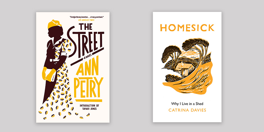
One cover I enjoyed working on was Homesick by Catrina Davies as I got to spend a day carving and printing lino. It was a rare treat to get lost in the physical making of something.
After receiving a brief to design a cover, do you tend to research books in the same genre to get inspiration or do you try and stay away from them? Why?
I don’t necessarily research other covers after receiving a brief but I do take notice of covers that I like, either in the bookshop or on instagram. It’s also good to look outside of publishing to get inspiration. I’m trying to get away from my desk more often, to get out and see more exhibitions.
Your designs are usually very vivid and full of colour. What or who, you find, inspires them?
I get a lot of inspiration from printed ephemera of the 30’s, 40’s and 50’s. Matchbook covers, luggage tickets, packaging. There’s something about the simplicity and directness of the designs that I find appealing.
Often artists aren’t creating the first cover for the book (ie re-issuing, changing covers for different markets). Have you ever worked on a cover like this? If so, do you tend to check the other versions of the cover before starting your own work?
I recently designed a new cover for The Street by Ann Petry, originally published in the 50’s. It’s a great book but not hugely well known so it was good not to have too many preconceptions before starting it.
Do you have a favourite book genre to design for?
I have a love hate relationship with literary fiction. It’s a genre with a lot of creative freedom which can lead to some lovely results but can also be maddening if you’re stuck for an idea.
Can you see any book-cover trends around the world at the moment that you especially enjoy/dislike?
There seem to be a lot of paintingy (not sure how else to describe it) covers at the moment which I like. Inland by Tea Obreht (design by Jaya Miceli, art by Tamara Ruiz), Tears of the TrufflePig by Fernando A. Flores (a totally bonkers design by Na Kim which I love), Mothers by Chris Powers (design by Grace Han). For a very good blog on book cover design (covers and trends) check out The Casual Optimist (casualoptimist.com).
Do you have a dream book you’d love to design a cover for one day?
Len Deighton’s Action Cookbook
To find out more about Nathan visit his website.

