
Designer Mark Swan: Interview
- 12th November 2019
- Category : Blog,Interviews & Blogs
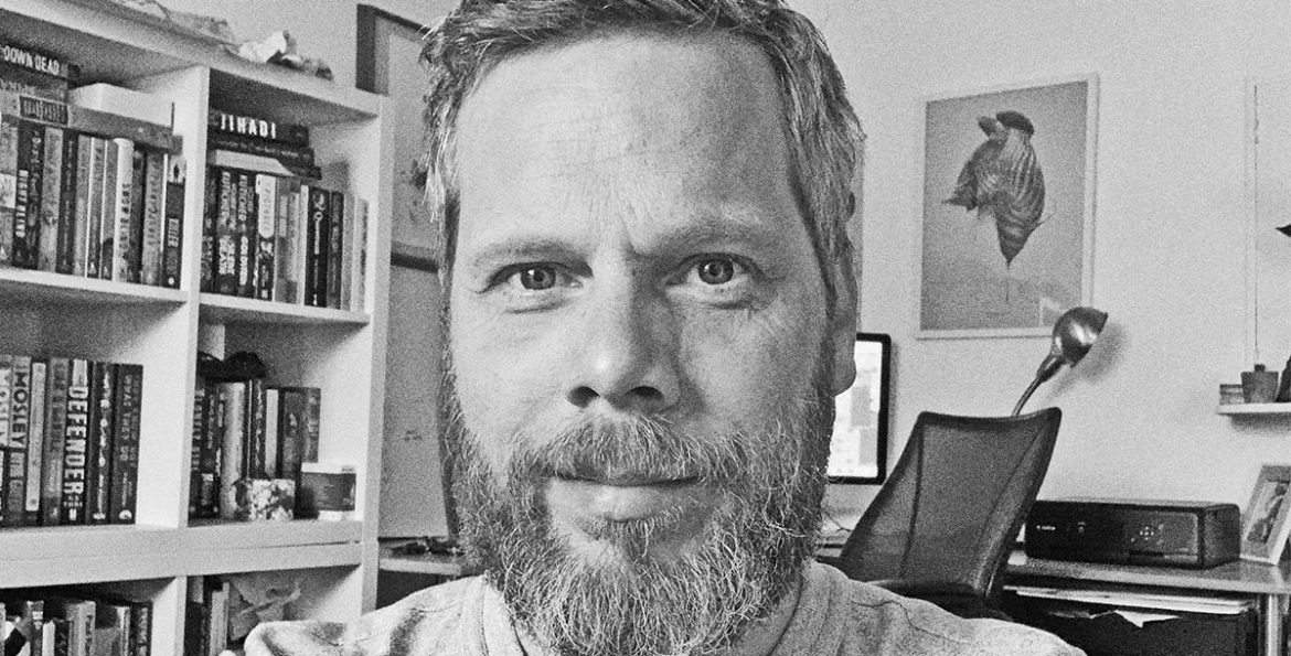
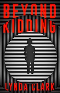
Mark Swan is the designer behind the cover of Beyond Kidding. We’ve talked to him about his path into graphic designing and his creative process.
How did you get into the arts and what led you to graphic design?
I was always drawing from a young age and was very much into comic books and wanted to work in that field. I went to university and quickly realised my drawing skills were not going to cut in the comic book world. With fantastic guidance from tutors I got into montage illustration and photography and then learnt Photoshop toward the end of my studies. When I left university I did feel a little lacking in direction but somehow managed to get myself a weekly gig at the Financial Times illustrating articles for their weekend magazine. I worked for a few more magazines and newspapers and then got my first book cover design commission for the BFI. From here I realised that book covers would offer me a way to explore many different styles and genres in one industry so I looked for work with publishers.
You mention on your website that you also work in the music and film industry. Do you have a favourite medium you design for?
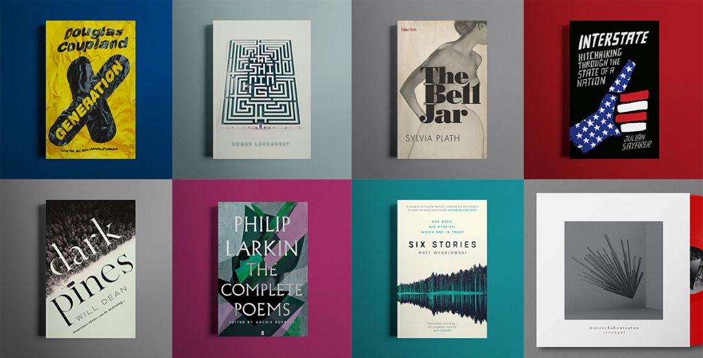
Not really. They each have something to offer creatively. The book cover design work and the film poster work are quite similar. Distilling stories into a single image. The music design work is quite different as there is very little or mostly no narrative to go by. Just your reaction to sounds and picture and the images they conjure in your head. In the end all are about reflecting a genre or tone to an audience.
What is your process for producing a book cover?
I will get a brief. This can be several pages long, just few lines or sometimes it’s just the manuscript or an existing book. Sometimes they will give me ideas of imagery from the book or even be very specific on what they would like on the cover. From here it can go in many different directions depending on the brief. I can be finding an image and then placing type on that. Doing a full-cover illustration is sometimes in order or doing my own photography. I can have images form in my head when reading the briefs. Other times I need to sit down with a sketchbook and sketch out ideas or do word association to trigger possible designs routes. There can be picture research on picture libraries or looking for inspiration in books or the internet. Sometimes it’s even watching a film or listening to an audio book (if the book is already published this is great as I’m a darn slow reader) to get inspired. After the ideas are in place it’s creating the cover which always goes through the computer at the end and then the visuals are sent to the client once I have enough of them to give them choice. Then I await feedback and we go from there.
Are you a reader yourself? How much of the book do you need to read before designing a cover for it?
Ironically I’m not much of a reader. Or not enough of one for my liking. It’s not through a lack of desire or trying. I find it hard to make the time and also when you have been staring at tiny pixels on a screen all day the swap to tiny words on a page at night usually results in me nodding off after about 5 pages. That said I am a massive consumer of literature in the form of audio books. When I’m reading a book for work I like to either read the whole thing or no more than the first 100 pages (depending on the length of the book). With this I find I get enough of the tone and flow of the book and its characters but don’t know too much about the plot and its direction so as to not get too fixated on an aspect of the story that might give too much away to the consumer.
How hard is it to follow someone else’s guidelines to create the designs? Is there anything clients could do/stop doing to make your work easier?
Like most people it’s hard when you have done something you really like and are proud of and then you have to, in your eyes, make it worse through other people’s opinions. But at the end of it all you want to do a good job for the publisher and the author and create a design that they are happy to put on a shelf. It can be annoying when a publisher says they don’t like a design but they can’t really tell you why or where you should go from there but these situations are rare.
When working, do you prefer to be given artistic space to ‘do your thing’ or do you like to be supervised?
As I mentioned it’s great to have creative space but this can have its own problems. Having space can lead to you wandering around with no real direction or final destination in mind. That said it can be excellent to really flex that creative muscle and do something that truly reflects your vision of a story. It’s a very proud moment when you have done a design and you know it’s pretty much 100% you. I have an Instagram page that has covers that where ‘killed’ because I was really happy with them and I hated the idea of having them just on a hard drive festering. Those covers are usually 100% me but ultimately not 100% right. On the other hand being given a concrete direction from a client can be just as pleasurable. Knowing what the design needs to be and then bringing that image to life using your skills can be just as rewarding.
Could you walk us through your working process for creating a jacket for Beyond Kidding?
This was one of the books I read in its entirety. I made notes and picked out lines or paragraphs that evoked images in my mind. From here I started to do some sketches. I found the book quite disorientating at times. Feeling the confusion of the main character. I started to think of illusions or images that messed a little with your eyes and mind. Pop art very much influenced the look of the design. From here it was trying out different designs using various tools and programs. I brought a new plugin for Adobe Illustrator that turns images into dots or lines and experimented with that but in the end a simpler design was needed for impact. I also wanted to get over the different words and layers to the story. Ultimately it all came down to this strange boy. Who is he and where did he come from? So he became the focus of the cover.
 What’s the longest/shortest time it took you to finalise a cover design?
Couple of hours to a couple of years.
What has been your favourite cover to make/which one are you the proudest of?
There are loads I’m really proud of. They are usually the ones that I have illustrated or photographed myself. So a cover I have created from scratch. The covers I’m most proud of are the ones I know the author loves as that’s the highest accolade. Knowing that you have honoured their hard work and created an image that they are proud to be on the cover of their book is a real buzz.
After receiving a brief to design a cover, do you tend to research books in the same genre to get inspiration or do you try and stay away from them? Why?
That can be down to the publisher. Whether they want to have a cover that is true to a certain genre style or want to break new ground. In the end looking at titles in the same genre through the ages is a good thing to do for sure as it can help with what you want to do and what you want to avoid.
Your designs seem full of movement. What or who, do you find, inspire them?
Oh that’s a nice thing to say, cheers. I would say the things that inspire them most tend to not be book-cover related. Music is a big one, I’m a huge consumer of music. One of the many perks of this job is I get to listen to music all day. Most designs have a soundtrack to them of tracks I was listening to at the time or sometimes I will read a brief and think ‘Oh I should listen to that album while I design.’ Film is another big one. Painting, comic books, the list goes on and on. It’s amazing what can inspire you.
Often artists aren’t creating the first cover for the book (ie re-issuing, changing covers for different markets). Have you ever worked on a cover like this? If so, do you tend to check the other versions of the cover before starting your own work?
Yes I’ve done a fair few of these. They can be very daunting as sometimes they are for books that are close to your heart. You get the design fear which can be a great motivator or can be a little stifling. I remember getting the design brief for the BFI classic edition of the Shining. I got the proper fear for a while of how I could do such a design justice. I find it’s always wise to do your research on these books. Sometimes I have found that I do a design for a cover of a book that’s a redesign only to find later down the line that it’s very close to another design for the same book done by another publisher in another country years back so having a knowledge of what’s gone before can’t do any harm.
Do you have a favourite book genre to design for?
I rather like doing poetry as there’s quite a bit of creative wiggle room for interpretation and the client is a bit more responsive to out of the box ideas. The one genre I’ve not done much of is Horror and I’d love to do some more of that.
What are you working on at the moment and do you have any book design-related future plans?
I have another BFI classic I’m working on which is really exciting. There’s quite a lot of work on right now in many different genres to get excite about. I’ve also brought some 3D software that I’m itching to get to grips with.
To find out more about Mark visit his website.
