
Designer Emma Rogers: Interview
- 29th September 2020
- Category : Blog,Interviews & Blogs
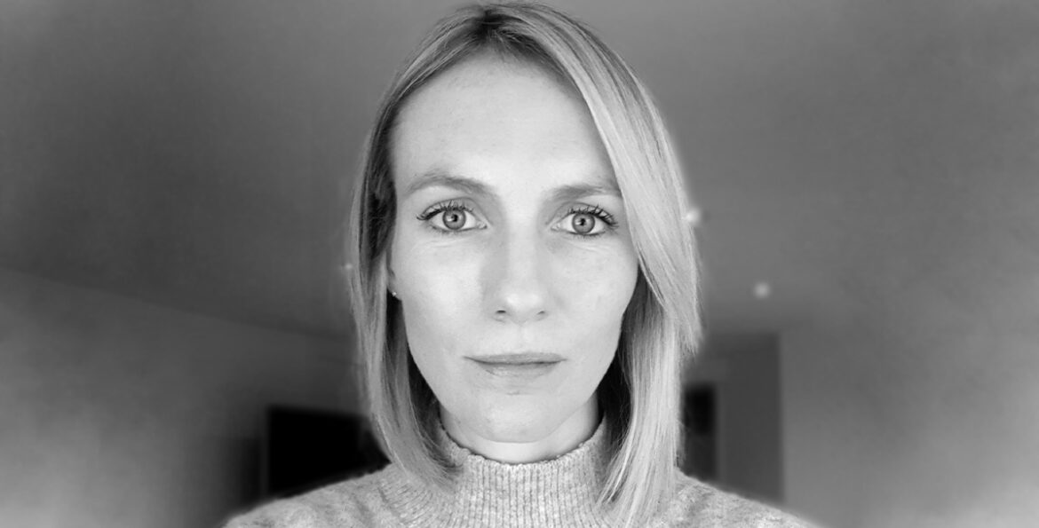
Emma Rogers is the designer behind the cover of Valhalla. We’ve talked to her about her path into graphic designing and her creative process.
How did you get into the arts and what led you to book design?
I always had a passion for drawing and being creative as a child. I loved knitting and making my own clothes, all influenced by my fabulous grandmother. You wouldn’t think it now, but I was also pretty good at maths, especially at A-level and at one point, I was tempted to pursue that route in some form or another. Luckily, I had the most inspirational art teacher for A-level Art and I truly believe that without him and his brilliant enthusiasm, I wouldn’t have chosen to continue along that path. After completing a Foundation course in Bournemouth and a BA Hons in Graphic Design and Visual Communication at Kent Institute of Art and Design, I was fortunate enough to be introduced to Lucie Stericker, the creative director at the Orion Publishing Group. She took a gamble and offered me work experience which later led to a full-time role as designer in her design department. I owe an awful lot of my success in design to Lucie.
You mention on your website that you specialise in print design and lettering. Have you worked on or would you like to work on designing anything else?
I have designed the odd logo and wine label but on the whole I have always been in book cover design. What I love about it is the challenge to create something unique within a fixed format. Designing book covers is very rewarding and I feel very lucky to work within the publishing industry. Other than book design, I’ve always thought designing window and in-store installation displays would be really fun!
What is your process in producing a book cover?
Initially, I try to gather as much information about the book as possible. If there is a manuscript available then I will definitely dip into this. I spend a lot of time brainstorming and looking through other sources of inspiration, whether this be online or having a walk through town, mooching around the card and gift shops. Inspiration can hit you when you least expect it!
Are you a reader yourself? How much (if any) of the book do you need to read before designing a cover for it?
I love reading and wish I had the time to read more than I do. I will binge read when I go on holiday. It’s pure escapism for me! When designing a cover, it’s always beneficial to have some of the manuscript to hand, just to get a feel for the book and the style of writing.
When working, do you prefer to be given artistic space to ‘do your thing’ (and if yes, do you feel like you are given enough space) or do you like to be supervised?
I actually work alone in my basement so have no one around to bounce ideas off, which is definitely the down side to freelancing. It took me a long time to get good at hitting the ‘send’ button without going crazy making tweak after tweak first.
Could you walk us through your working process for creating a jacket for Valhalla?
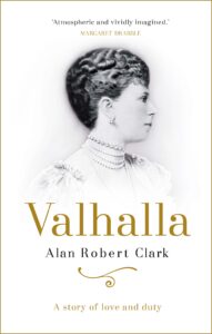
The brief for this was perfect as you knew exactly what you were after. I was asked to find a great picture of Mary of Teck, so this was my starting point. Having found a number of lovely images, I spent time researching period lettering and started to play around with ways in which to adorn the cover authentically and make it more tactile. I wanted it to be simple and classy.
Do you sketch your ideas by hand or using software?
I always sketch very rough ideas in my pad along with very illegible notes.
What’s the longest/shortest time it took you to finalise a cover design?
This one was actually one of the quickest I have had!
What makes a great book cover for you?
A cover that instantly grabs my attention making me want to pick it up.
What has been your favourite cover to make/which one are you the proudest of?
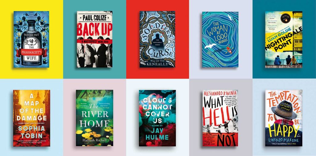
Oh wow… now I’m stumped! I have enjoyed the journey with so many of the covers I have designed. I love briefs that open up an opportunity to get back to basics in terms of illustration or to get creative with the lettering. One cover I particularly enjoyed working on was The Soldier’s Curse by Meg and Tom Keneally. I had a lot of fun researching Australian pattern and print design. I painstakingly but lovingly illustrated the pattern across the cover. I was seeing dots for a while after!
After receiving a brief to design a cover, do you tend to research books in the same genre to get inspiration or do you try and stay away from them? Why?
It’s good to get an idea of the competition and where the book is going to sit in the market. It’s also a good way of knowing what to stay clear of or how to make your cover look different and fresh alongside what is already out there.
Your designs are usually very vivid and full of colour. What or who, do you find, inspires them?
Yes, I’m not really sure where this comes from. I guess we are continually influenced by what surrounds us and often without realising it. I certainly have a love of colour, no one wants to live in a grey, monotone world! My absolute hero in illustration is Malika Favre. Her work is so incredibly vibrant and bold. Every piece she creates is intensely eye catching. My friends bought me my first Malika print for my fortieth birthday and I am now eager to build up my collection.
Often artists aren’t creating the first cover for the book. Have you ever worked on a cover like this? If so, do you tend to check the other versions of the cover before starting your own work?
I have to admit, sometimes I’m almost too scared to look at old covers as I run the risk of having the original stuck in my brain, blurring any originality. If the brief mentions the original cover and how they want it to retain certain elements, then I will research it, but it can be more rewarding to go into the first round of visuals with a fresh, clear take on a title.
Do you have a favourite book genre to design for?
I wouldn’t say I have a favourite genre but I am always keen to have a challenge. I enjoy working on YA which I have dipped into more over the last few years. I find the opportunity to create designs for a genre that, age wise, I don’t fall into, very challenging.
Can you see any book-cover trends around the world at the moment that you especially enjoy/dislike?
Trends change all the time but I will always be drawn to typographic-led designs. I have a real passion for lettering and love seeing new ideas and approaches. I particularly love Kimberley Glyder’s work and anything designed by Jack Smyth or Anna Morrison is always a winner.
What are you working on at the moment and do you have any book design-related future plans?
I am currently working on a number of lovely briefs that I am very excited about. I’d like to think that one day I may go back in-house but for now, my kids need me at home and life is good the way it is. I feel very lucky to be in this industry and to have worked with some incredibly talented and highly regarded creatives and art directors.
To find out more about Emma visit her website.
