
Designer Marina Drukman: Interview
- 21st July 2020
- Category : Blog,Interviews & Blogs
Marina Drukman is the designer behind the cover of Conception. We’ve talked to her about her path into graphic designing and her creative process.
How did you get into the arts and what led you to book design?
When I was growing up, I kept covering surfaces around me with drawings: napkins, newspapers, walls, notebooks, my hands, etc. I wasn’t planning on doing art for a living, and fine art didn’t seem like the right way to go – for some reason I thought I’d be required to wear a beret and carry brushes everywhere I went. Then I moved to New York, discovered commercial art, something less traditional, and it felt right. I went to SVA to study graphic design. My first degree was in philology and linguistics, so book design seemed like a logical step.
You mention on your website that you mostly work on book covers. Have you worked on or would you like to work on designing anything else?
Absolutely. I like changing things up, it keeps things interesting. I don’t subscribe to the idea that one should be a book designer, or a web designer, or a brand designer, and so on. Currently I work in books, and I had two full-time jobs in magazines, but I take on different freelance projects: logos, packaging, web design, etc. I love books, but it’s an open relationship.
What is your process in producing a book cover?
It depends on the book. I find that fiction requires a more intuitive approach than non-fiction, which is more logical. But I always start with reading the book, then reading a brief from a client or an editor. Once I have enough information, I sketch things out. Sometimes I’m not entirely sure what to do right away, then I let it sit, and let ideas develop in my brain while I’m doing other things. It has to grow, as with pregnancy. Most of the time, the solution presents itself. Other times, I know where to go right away. I usually present a few different directions to a client. Once I have an approved direction, I finalize the cover. Conceptualizing is the hard part; everything else is fun.
Are you a reader yourself? How much (if any) of the book do you need to read before designing a cover for it?
Definitely a reader. But reading for work is a very different process than reading for pleasure.
I read until I have an idea of what to do. Sometimes I need to read only about a quarter of the book; other times, the entire book. Occasionally I will read an entire book because I can’t put it down. That happened with Conception.
How hard is it to follow someone else’s guidelines to create the designs? Is there anything clients could do/stop doing to make your work easier?
It’s easy for a designer to follow directions, as long as they are not conflicting. To me, a good client is open-minded. They don’t ask designers to create something they have seen on some other book. Each book is unique, and ideally each cover will be as well. I think it is our responsibility to not visually pollute the world with clichés.
When working, do you prefer to be given artistic space to “do your thing” (and if yes, do you feel like you are given enough space) or do you like to be supervised?
I prefer to do my thing, though it’s not always possible, which is OK. More commercial projects almost always means more supervision and stricter guidelines, while having more freedom will always produce better results. But it’s good to have some idea of what a client wants, otherwise I can be all over the place.

Could you walk us through your working process for creating a jacket for Conception?
What stood out to me most about this book is that I was reading about a psychopath who had no concept of empathy and who was gradually losing his mind. He heard only his own voice, his own reasoning; everything else was of no consequence. This made me want to create a visual that would show a character being consumed by himself not only in a physical sense, but also mentally and emotionally – he is closing in on himself. Hand lettering was used to illustrate his juvenile mind; and also because the character is an artist, I thought a straightforward typeface would be too clean for this book. The dark void that’s created by the repetitive circular drawing motion is illustrating the character himself, as well as the plot of the book.
Do you sketch your ideas by hand or using software? Which did you use for Conception?
I sketch almost always by hand at the beginning of the process. The computer comes in later. It’s faster this way. My sketches are pretty rough, I just put some ideas down.
Most of the elements on the Conception cover are hand-drawn, aside from the photograph, which had to be slightly retouched. I got rid of the head (to replace it with the drawing) and the tie (I didn’t think this character would be wearing a tie). Then I put it all together in Photoshop.
What’s the longest/shortest time it took you to finalize a cover design?
Some projects may take many rounds of revisions. Others are lightning-strike fast. Once, I got a cover approved on the first try, with only two sketches. The entire process from sketch to approval took about two weeks. It was a freak accident. But sometimes a cover will be returned to me after being approved by everyone, because it hadn’t gone through someone important in sales, and then I have to start from scratch. That mostly happens with “big books.”
What makes a great book cover for you?
I always loved covers that make a point without trying too hard, that are minimal and smart. That take an unexpected approach. Something that evokes emotion, makes you think, question things. Something that makes me think, ‘I wish I had thought of that.’ Inventive typography. Something breathtakingly gorgeous – that never gets old.
What has been your favourite cover to make/which one are you the proudest of?
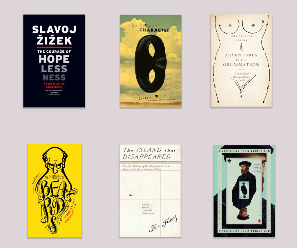
It’s difficult to pick one. I enjoyed working on Conception very much – it was just so up my alley. I will never get over the fact that my design for Adventures in the Orgasmatron got approved and printed. I am still quite pleased by how The Mirror Thief paperback cover turned out. The Island That Disappeared is a funny cover that The New York Times wanted to interview me about – it was a proud moment.

After receiving a brief to design a cover, do you tend to research books in the same genre to get inspiration or do you try and stay away from them? Why?
Yes and no. I prefer not to get distracted by other covers. I will look at them, though, if I get stuck and need help to get things moving.
Your designs seem full of movement. What or who do you find inspires them?
Living in New York City, where art is everywhere, you don’t have to look too hard. There are unbelievably gifted designers here, who are my heroes. I’m also very much inspired by traveling the world and seeing things from new perspectives. I like looking at visuals created by nonprofessional artists – graffiti, protest signs – because sometimes not knowing the rules is an advantage.
Often artists aren’t creating the first cover for the book (i.e., reissuing, changing covers for different markets). Have you ever worked on a cover like this? If so, do you tend to check the other versions of the cover before starting your own work?
Yes, I’ve worked on a number of redesigns. I do look at previous versions as a starting point, as it’s important to see where it has to be taken away from.
Do you have a favorite book genre to design for?
I think literary fiction is my strength. I enjoy quirky innovative writing. I like working on philosophy books: their covers can be very punchy, and minimalistic, which I like. Anything European – that just agrees with me because I’m European.
Can you see any book-cover trends around the world at the moment that you especially enjoy/dislike?
I have a tense relationship with design trends, as they inevitably become clichés after being heavily recycled. But they are hard to escape.
I’ve always liked hand-drawn designs, both seeing them and making them myself.
Do you have a dream book you’d love to design a cover for one day?
My favorite book is The Master and Margarita, and I’d love to design a cover for it – but if it came down to it, I’d probably get anxious, because I feel that nothing can do this book justice.
What are you working on at the moment and do you have any book design–related future plans?
I am starting a new list at my full-time job, so it’s a lot at the moment. One that really stands out is A Mind Spread Out on the Ground by Alicia Elliott – it’s a heart-breaking book. I also just got my first project from Harvard University Press, which I’m very excited about.
I hope to get to work on more art books, not only covers, but interiors as well. I’ve done a few of these, and I loved the process.
To find out more about Marina visit her website.
Portrait photograph taken by Deb Klein.


