- Home
- Interviews & Blogs
- Illustrator Finn Campbell-Notman: Interview

Illustrator Finn Campbell-Notman: Interview
- 3rd August 2017
- Category : Interviews & Blogs
Finn Campbell-Notman is the book illustrator of the recently published short story collection by Helen Stancey The Madonna of the Pool. Recognisable for his lyrical imagery, Finn is the artist behind many well-known books. These include the striking and famous cover of a girl dancing with Death for Markus Zusak’s award-winning novel The Book Thief, as well as a number of fully illustrated books for The Folio Society.
We have chatted to Finn about his profession, the process of illustrating for literature and his work on Fairlight Books’ the Madonna of the Pool.

How did you get into art & design and what led you to book illustrating?
Very simply, it’s both a result of nature and nurture. Nature – both my father and my stepfather were artists. Nurture – I grew up in an artist and artisan community set within 14 acres of woodland that included a sculptor, a printmaker, a violin maker, a thatcher, a painter, and my mother, who was a weaver. I received an early basic training for each of these trades.
My career (I hate the term ‘creative’ – everyone is an ‘artist’ now) is so deeply rooted that the various things I do and have done seem to me to be intrinsic, second nature and natural. If anything could sum it up, without sounding glib – all else besides necessity is cultural and artistic. Making things is what we, humans, do, once those necessities are taken care of. So, I understand why everyone wants to be considered creative – it has a caché, a mystique and an attraction that being a ‘middle man’, a veritable estate agent can never have. Be a maker not a parasite – in that sense, my credo is simple.
The first book I illustrated was Italo Calvino’s Marcovaldo – I had a bit of a thing for Italian mid-century film and literature at that time. I am and always have been a broad and deep reader. I used to say to myself – I shall gather my books around me, for every one contains a world, a life, a viewpoint, a perspective that I did not know or imagine before. Again, we make to make sense of everything, and stories are the basis of everything. That’s where that aspect of my artistic output stems from.
Throughout your career you have lived and worked all around the world. Are there any differences between working as an illustrator in the UK and anywhere else?
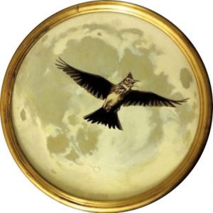
Not really. As an illustrator, I began at around the time when the internet was really beginning to get cooking. I’ve worked for clients on most continents and everyone wants the same thing – what’s in the art-directors head, not yours, and they want it yesterday.
I am currently doing a true crime book for Kindle in Motion for Amazon. Being somewhat analytical, academic and thorough I need time to get into the book to feel what the writer was after. Essentially, a good editor gives a facilitative art-direction and is someone who understand and trusts the illustrator. A good literary illustrator, given enough time, ‘translates’ the writing into imagery, and, having read so much in translation, one knows when it is ‘true’.
How is book-illustrating different from your other work as an illustrator/artist?
I love book illustrating and, to my detriment, I really don’t get along with a lot else illustration wise. Basically, I am a fine artist. Being an artist to me is a process of discovering the world through my work and, by doing so, discovering myself – it is a reciprocal, ethical, moral and serious way to live. I know, that sounds pretentious and portentous, doesn’t it?
What is your process of producing a book cover?
A good book cover should do two things: it should seduce and hint at what’s within, but not give it away. And it should do it in a way that plucks the potential reader from the throng of browsers. The trouble is, most publishers have in-house book-jacket designers. And, frequently, it is they who tell you what they want, via the marketing and promotional meeting. That makes for endless repetition.
I must say doing The Madonna of the Pool was refreshing precisely for the absence of this process. The result being an interesting, non-generic cover, one that intrigues and seduces the browsing reader.
How much (if any) of the book do you need to read before designing a cover?
It depends. If I’m sent galleys, a PDF, or the final edit – I’ll read the whole thing. And sometimes I’m just sent a sample and that’s it. Fortunately, I’ve worked on and with some great writers who I would read in any case: Ishiguro, Oz, Auster, Hrabal, Nirmal Virma and so on. So, it depends.
Is there anything publishers could do/stop doing to make your work easier?
Trust me/us. After all, we are the pictorially creative people – why otherwise are you hiring us?
As an artist, I’m inherently resistant to being overly supervised. To have a ‘strong’ hand on your hand is actually to the detriment of the arrival of a good cover or illustration.
Could you walk us through your working process to design The Madonna of the Pool? How did you come up with the idea?
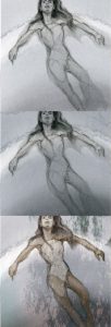


Firstly, find the gist, the summation of the story – what is it saying, how, to whom. That is, of course, an interpretation/translation. Secondly, how does that match my life experience? If it does, how does that feel, what does it trigger? For The Madonna of the Pool there were a couple of triggers. First, I’ve spent about thirteen years in southern Europe – I studied in Lazio near Viterbo so the landscape was there, ready to access. Second, the blasé observational male gaze from the point of view of the middle-aged character in the story. That’s a bit of a cliché, to be honest.
So how do I put the landscape with that gaze together in an interesting way? What popped into my head was Edward Weston’s photography of his wife Charis. The title rather suggested it – that vision and imaginary of the idealised, unattainable woman that is, in a sense, disembodied. Madonna meaning – desired but pure. It is pretty straightforward, when spelled out.
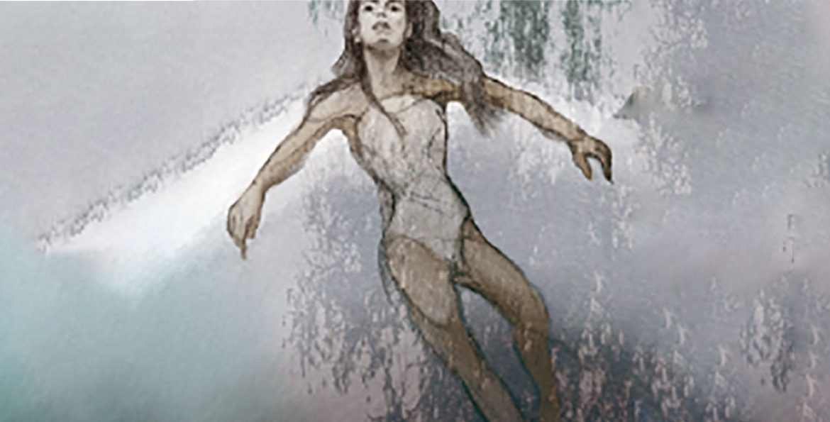
I thought the most important thing was that disembodiment, hence the floating figure. I thought that would make for a cover that seduced but did not ‘tell’, that was not literal. In general, I prefer that mode. It’s just a case of the trust given to that vision.
The floating woman was the first draft and I did a few versions of it. Then we went a more traditional route, which is the final cover. That one’s still a good, strong cover but more literal. The trick for me is to try find a solution that, even if it is a literal depiction, still has a particular atmosphere. That can come from a particular viewpoint – in the final Madonna cover we are placed in the position of the viewer/voyeur of this scene and thus become implicit – so there’s a twist to the idyllic Tuscan scene.
As it is, I’m very happy with the cover but I do think, graphically, the first draft of the floating Madonna had something with more ‘shelf power’.
Do you sketch your ideas by hand or using software?
Always by hand first – there is no substitute for it. No software is going to conceal bad drawing. John Berger said, correctly, that drawing is a process of enquiry – every mark has to be earned. In that sense, I’m a purist. Then comes the colour in Photoshop.
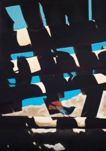
You have worked on books that already had numerous different covers (The Folio Society – The Remains of the Day, In a Glass Darkly, The Tiger in the Smoke). Do you tend to check the other versions of the cover to get inspiration or do you try and stay away from them?
Never do. I’ll check, maybe, after the first drafts are done, just to make sure I’m not replicating.
Do you have a favourite book genre to design for?
Literary Fiction
Can you see any book-cover trends around the world at the moment that you enjoy or dislike?
The production values of the last period leave a lot to be desired. If I’ve survived as someone who does book covers, it’s because I understood very early that rise of the internet and digital books would mean that the growth in publishing would be for those publishers who paid attention to a very well-produced artefact – a beautiful and well-designed book that would remain an item to be treasured and become aspirational. A book as a desired object, something with a premium.
I love good, well-produced books – always have, always will. In my current project, I’m trying to put the values I espouse into that medium. It’s the second area I noticed early on – the possibilities in augmented literature. Frankly, I want to read a book not watch a book, so it’s currently a challenge.
Have you noticed an overall change in the style of the covers you are commissioned to work on over time?
If I do notice one, it’s about the quality. I never get asked for gold-blocked author and title with a stock photographic image for a cover.
Do you have a dream book you’d love to design one day?
Several. I’d love to do the full set of B. Traven’s The Jungle Novels and his whole output. I’d love, more than anything, to have met Winfried Georg Sebald and have done his books. Briefly, an opportunity to meet him arose but then he died in that car crash. Roberto Bolaño, too, as well as many more. I’d love to work with a really good writer and have often thought about how one could truly make a book or a story that relied upon the text and imagery equally. I’ve thought about trying it myself – the writing and depicting both. But then, I realise that what I do as an artist is really quite similar and analogous to the poet: the distillation, synthesis and evocation, the attempt to make the complex clear and ‘readable’. That’s what I’m after as an artist.
What are you working on at the moment and do you have any book illustration-related future plans?
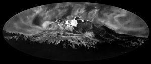
I have a series of large charcoals – about 3 metres by 1.5 that I’ve been working on since late last year. These will debut in Berlin in October. I have a solo show of my series of oils entitled The Immigrants in Dublin, also in October. As for illustrations, I am working on the Amazon/Kindle project. Mainly just keeping these plates spinning and surviving.
Visit Finn’s website or Folio Art to find out more.
Interested in book illustration? Read our interview with Rui Ricardo, the illustrator of Lou Gilmond’s The Tale of Senyor Rodriguez, here.
